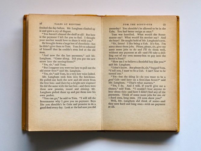
Open a book. Don’t read the words, but instead notice the white space and blocks of text. Formatting is the artistry of a book. No two are the same.
I recommend going to a book store to help you determine the artistry of your book. These books are products of big publishing houses. Your mission is to replicate the one you like the best.
Do this exercise with paperbacks, since that will most likely be your format. Open random books. IGNORE THE WORDS! Look at the color of the paper, style of the words, and the amount of white space on the page.
Compare chapter title pages with regular pages. Usually title pages have swirls, lines, or an image. Compare left and right hand pages (notice headings and page numbers). Use a ruler to measure the margins, letter height, line spacing, spacing between letters, size of the book, and anything else that seems significant.
Determine the measurements and characteristics that are the most pleasing to you and write them down.
Then check with who ever is going to print your book to see if they have any requirements. Createspace is particular with margins.
Next you are ready to set up your document using MS Word Formatting for Paperbacks.


